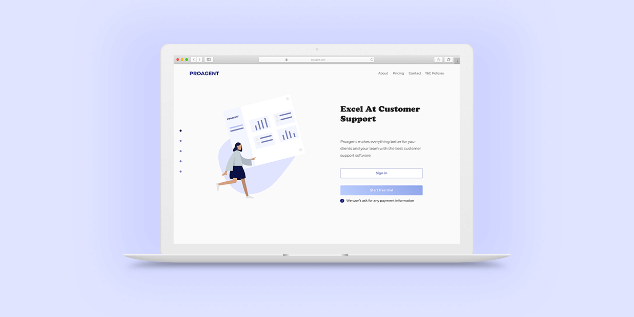
Mobile mockups

Stream Pals:

Streaming services recommendations

Case study:  Design iOS app.

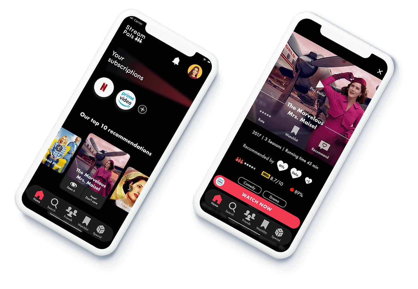
Goal:  Help people get good and fitted recommendations for movies and shows.

Scope:  Personal UX | UI Design project.

Role:  Solo project where I was responsible for all UX and UI design tasks.

UX Research
UI Design
IxD
Tool icon

Figma

Clock icon

5 Weeks

Problem context

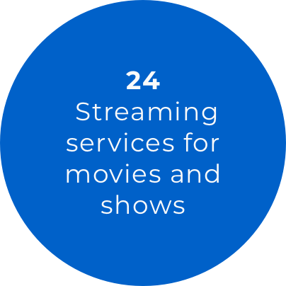
Currently there is a boom of movies and shows streaming services.  The huge variety of services can be overwhelming for consumers who can get easily lost in so much content.

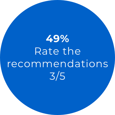
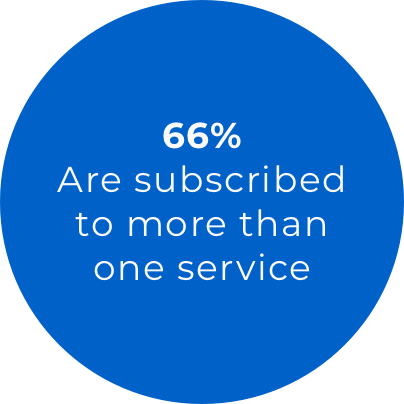
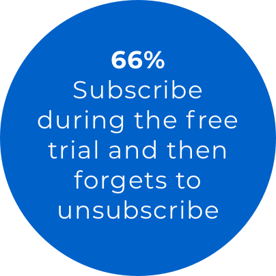
In Spain we can find the following numbers:

First problem insight Second problem insight Third problem insight

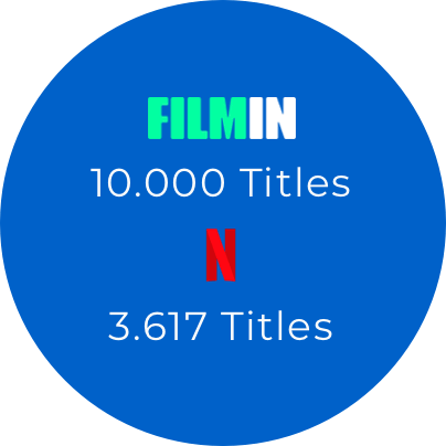
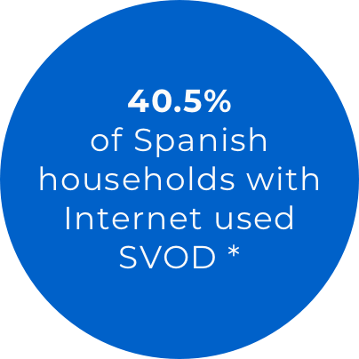
* Comisión Nacional de los Mercados y la Competencia (CNMC) - last quarter 2019

Design process

Design process

Research

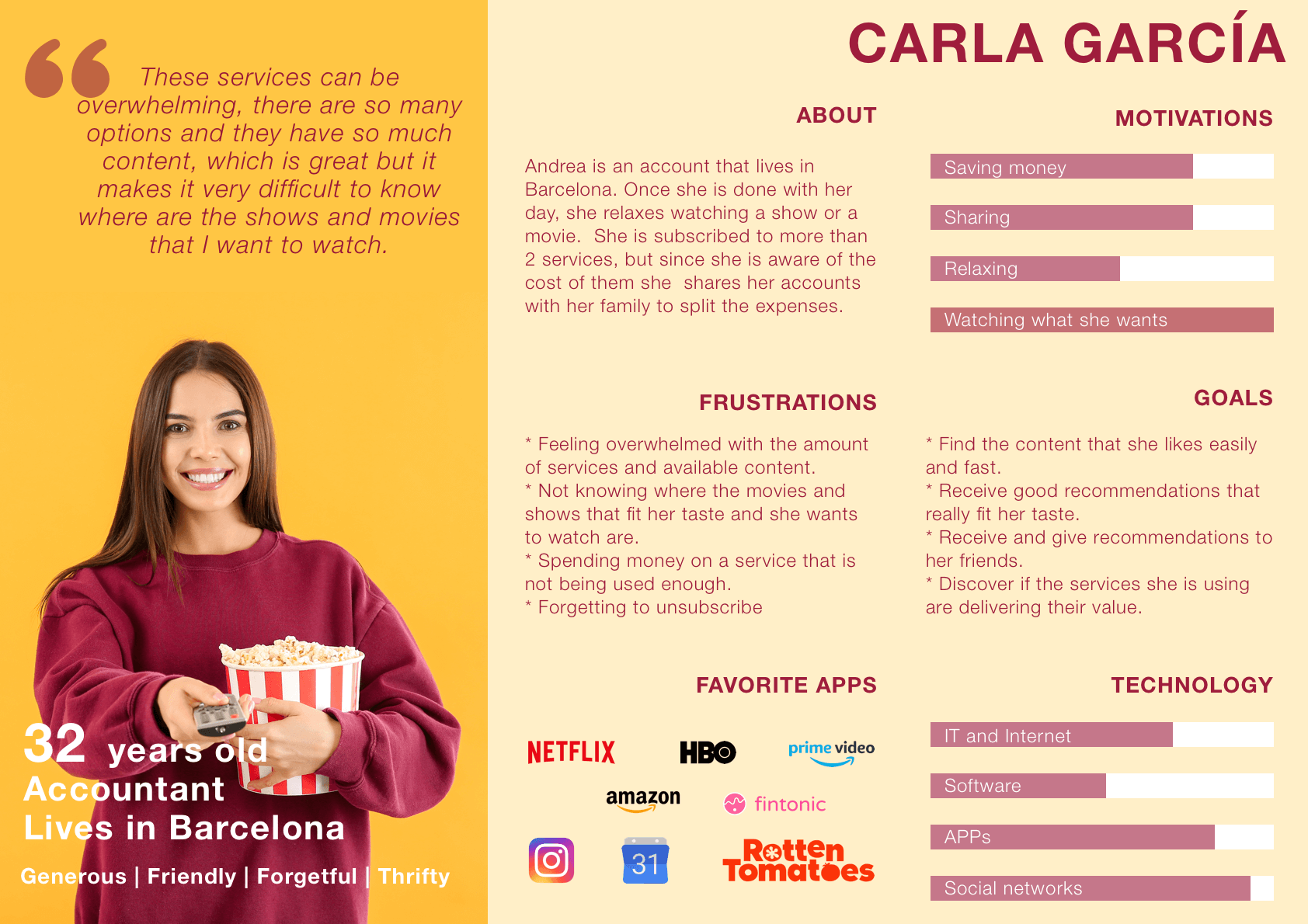
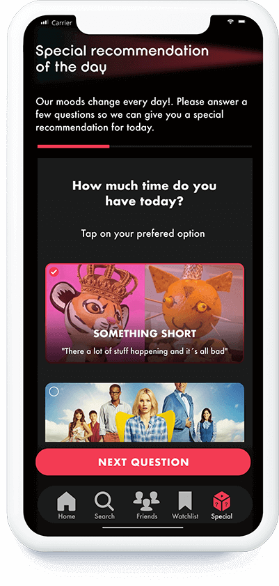
For the research process, I conducted interviews and shared a survey with people over 30 years old.  I wanted to mainly focus on people subscribed to at least one SVOD service.

My goal was to understand the struggles that people were facing with the streaming services that they had. Are they happy with the recommendations they receive?, What are they missing from these services?.

I also ran a competitive analysis to understand the weaknesses and strong points of the recommendations apps that are on the market.

Survey insights

First survey insight Second survey insight Third survey insight

Sample of 35 people

Interview insights

  • Like to receive recommendations from their friends and family.
  • Feel the recommendations are repetitive.
  • Don't know which service has all the seasons of their favorite shows.
  • Really dislike when they forget to unsubscribe after a free trial.
  • Will only use a free trial if they have different titles they would like to watch in that platform.

User

Persona

Persona

Pain Points

Carla's Pain points targeted

  • Not getting recommendations that are a good fit for her.
  • Not having a clear idea of where her favorite shows and movies are.
  • Forgetting to unsubscribe after free trials.
  • Getting recommendations from her friends in a disorganized way.

Information Architecture

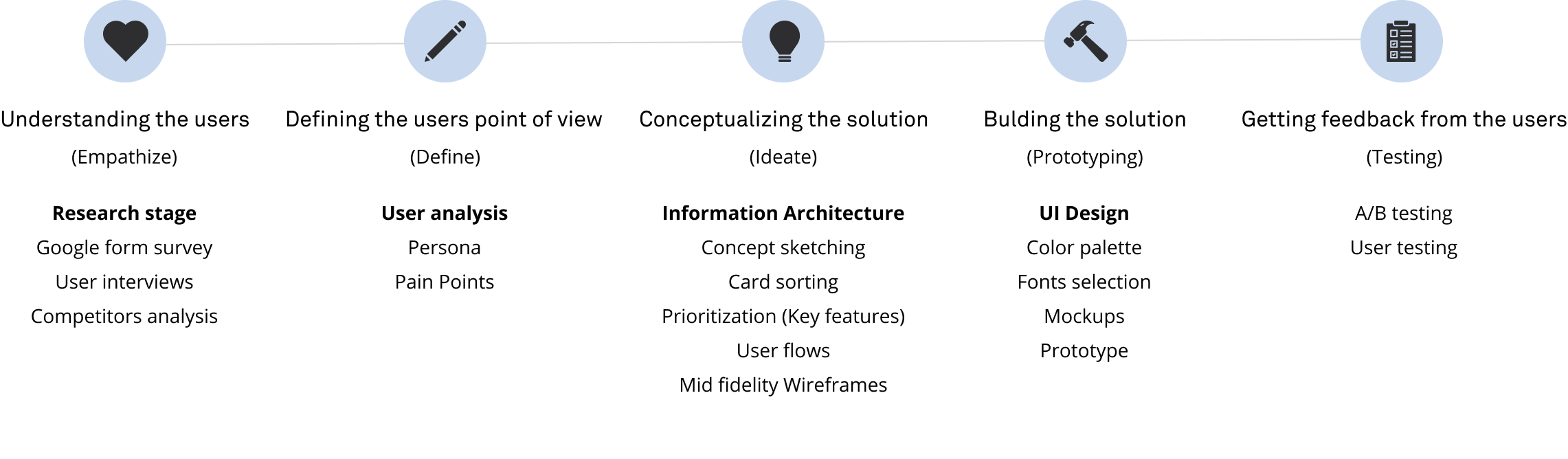
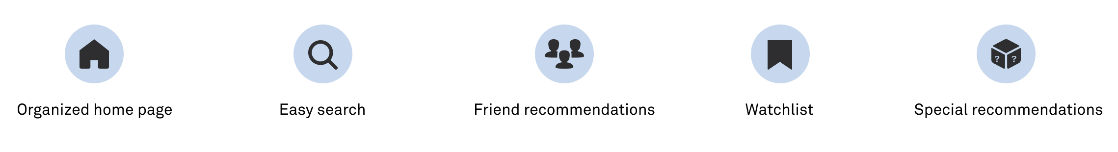
To build the site architecture I used the insights from the competitive analysis and a card sorting exercise to define how the movies and shows titles as well as the other main features should be distributed. From that analysis the site map was defined and consequently the concept sketches:

Site map and concept sketching

Key features

Key features
  • Home page with recommendations from the services the user is subscribed to.
  • Search option to look for a show or a movie.
  • Social feature to add friends, create groups and send and receive recommendations from them.
  • Watchlist to keep track of pending shows and movies.
  • Special recommendations section according to the users mood.

Wireframes

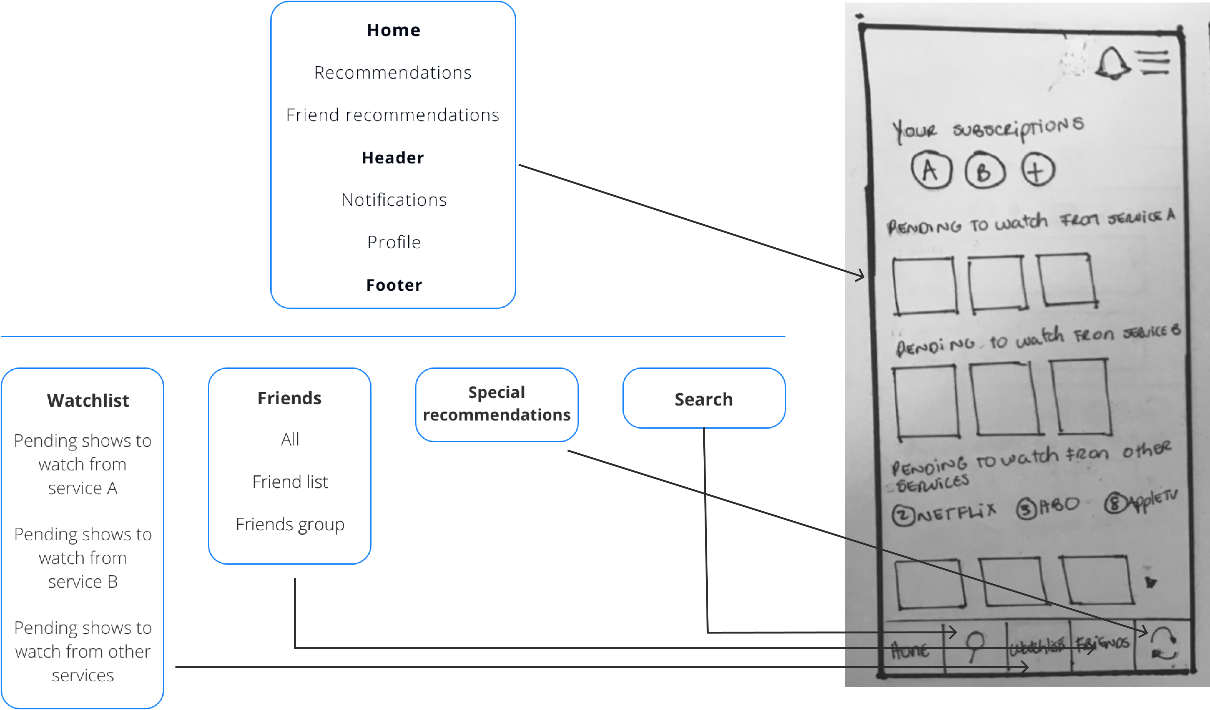
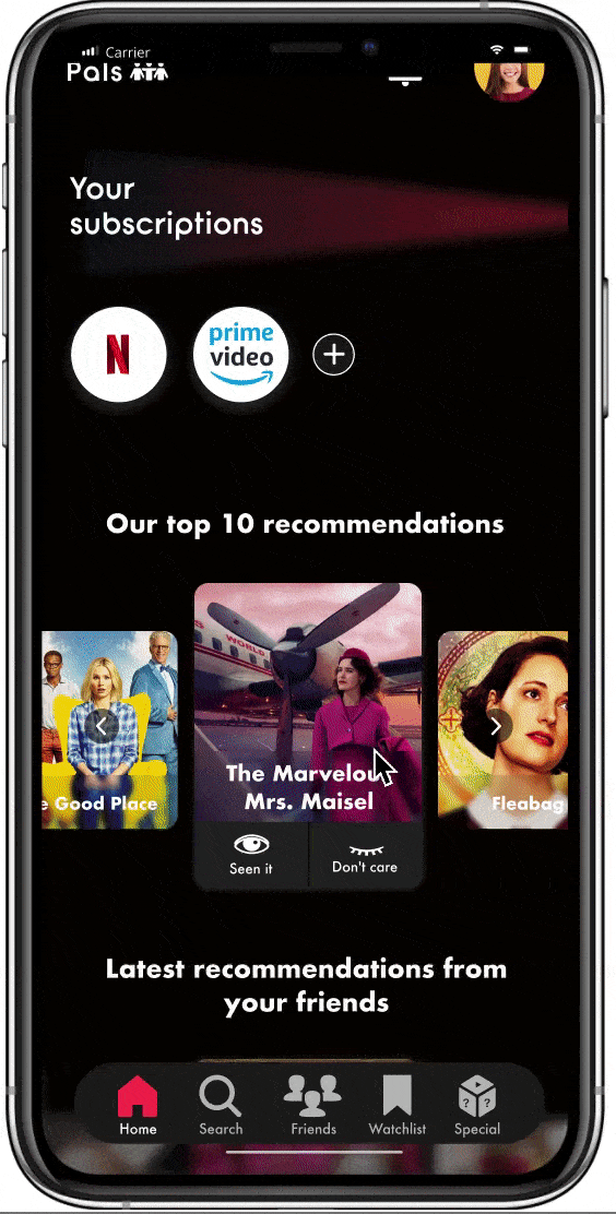
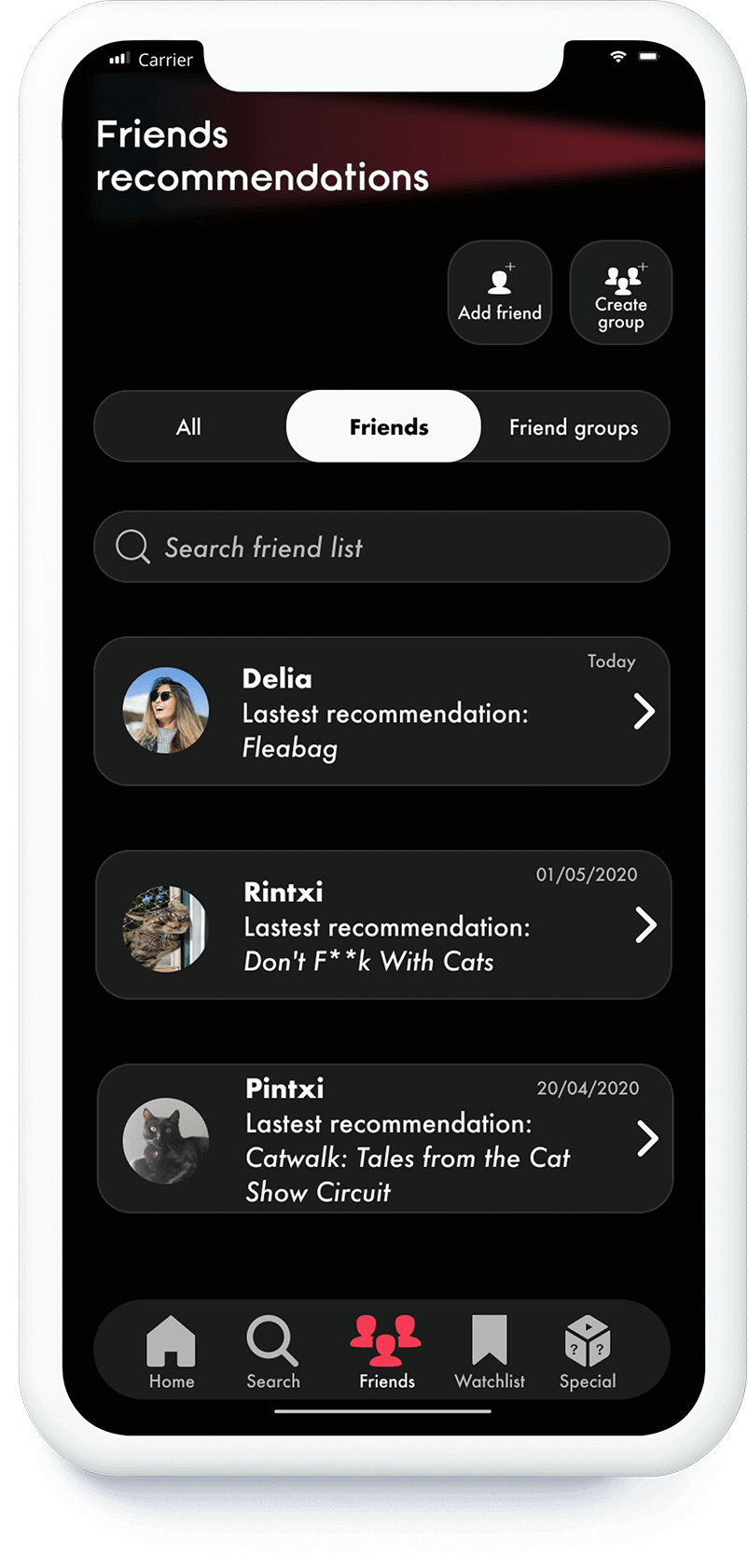
The app was design for mobile  since it would have social features (recommend shows and movies to friends) and those features would be easier to use from a smaller viewport.

User flows with mid-fidelity wireframes

Below is the user flow when Carla wants to add friends and send them recommendations. The flow is being presented with mid-fidelity wireframes:

  1. 1 - Go to friends section
  2. 2 - Click on add friends
  3. 3 - Search for friend
  4. 4 - Add friend
  5. 5 - Go to home page
  6. 6 - Select movie or show
  7. 7 - Recommend
User flow wireframes for adding friends and recommending a show

Testing

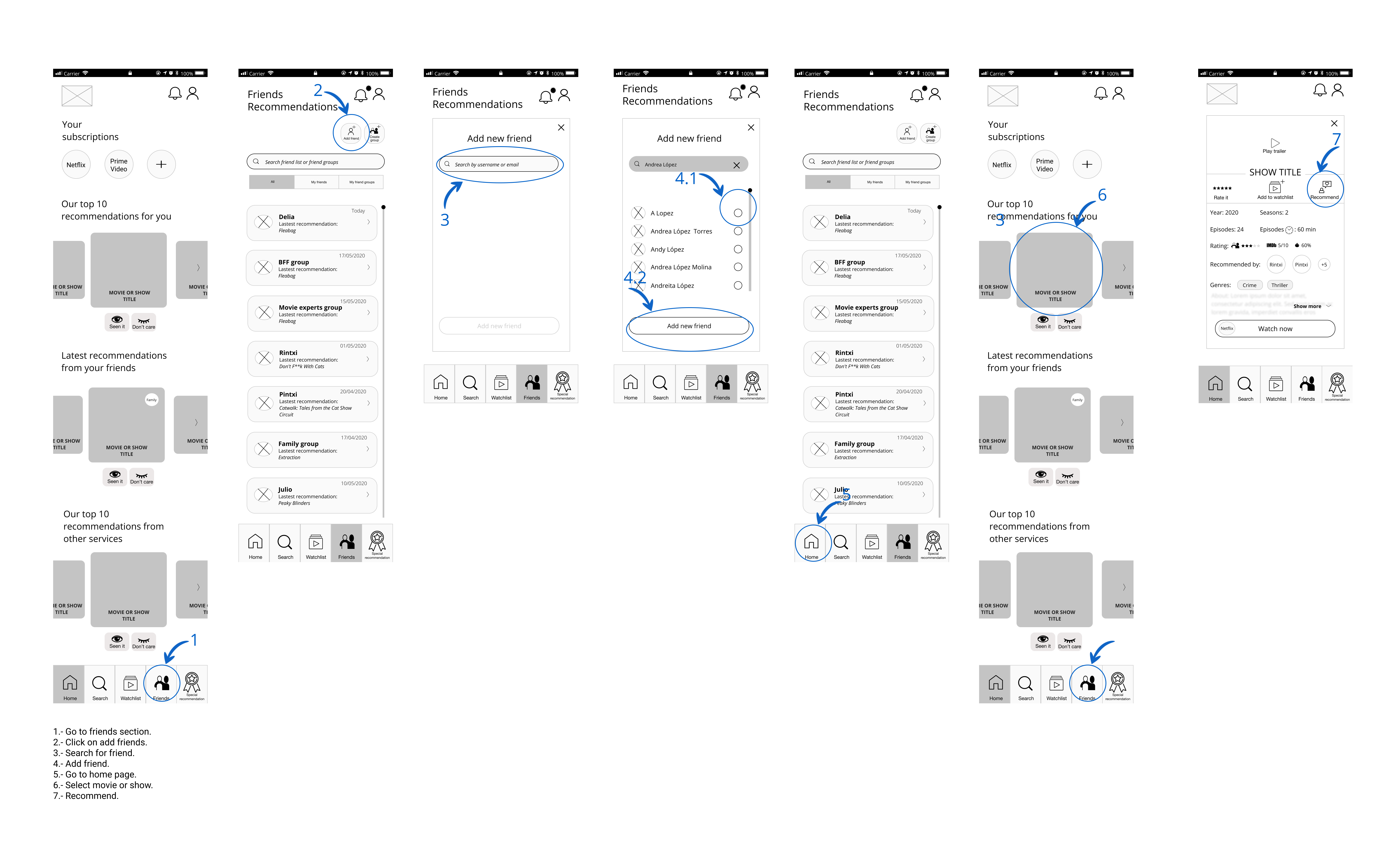
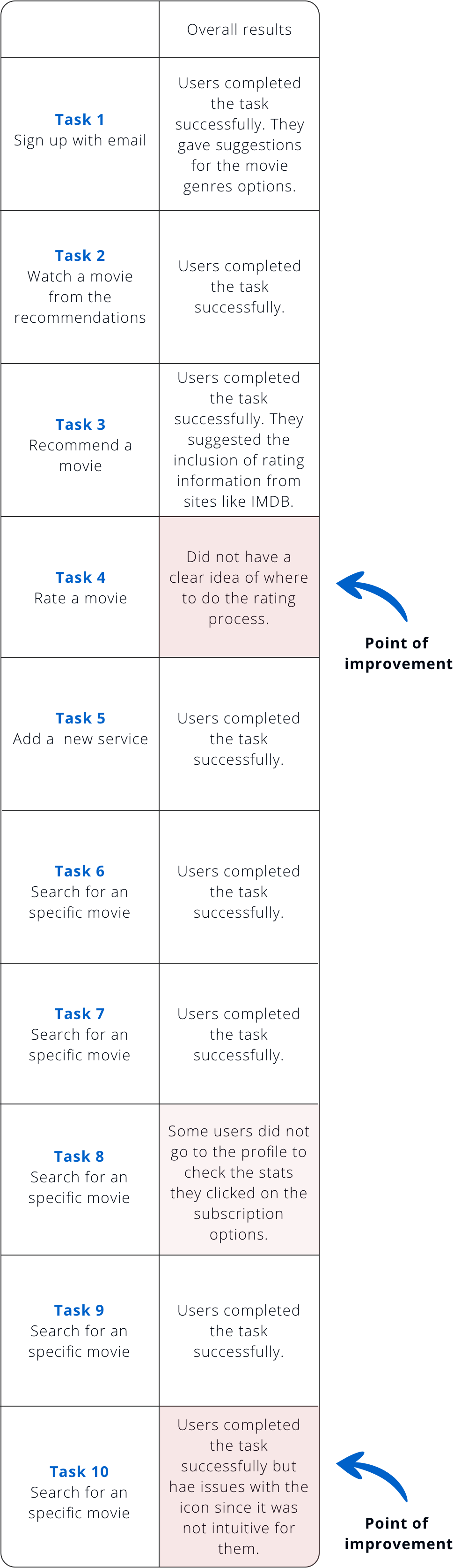
The first version of the Wireframes was tested on 5 users. The results help improve the design and the changes were applied to the mockups shown on the next section.

Test results
Test results

UI Design

Color palette

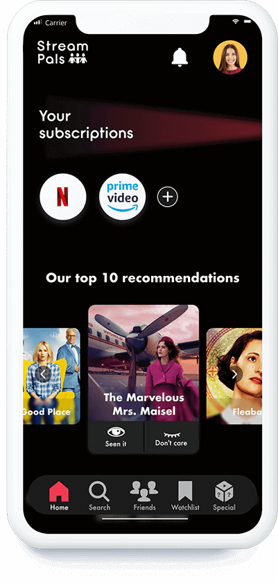
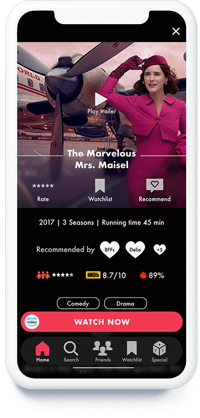
I wanted the movie posters to be the focus point on the screens, for that reasons I went with two shades of black for background. To create contrast and highlight the links and buttons, I went with two bright colors. For the text color I used white so it will be easy to read.

I´ve got the inspiration for these colors while I was working on my moodboard. I wanted to evoke the beam of light that comes out of movie projectors.

#060400

#1D1D1D

#FA3D56

#FDB12F

#FFFFFF

Fonts

I wanted the app to have a modern look, so I went for a circular font called Opificio for the main headers (H1 and H2) and for the smaller headers and the rest of the text I want with Futura since it complemented nicely the circular font and it is easy to read.

Opificio font bold
Futura font bold
Futura font medium

Mockups

Mockup home Mockup movie information Mockup friends section Mockup special recommendation section

Prototype

The following gif shows the user interaction when he wants to watch a class.

Outcomes & lessons learnt

  • Stream Pals offers an organized way for streaming services users to keep track of their favorite shows while they receive recommendations that adapt to their taste and mood.
  • One of the main challenges encountered during the project was deciding which icon to use for the non-commom section of the 'Special recommendations'. Through A / B testing it was decided which was the most appropriate icon but it also taught me that it was necessary to accompany all the icons with their respective labels to improve the findability of the app features.
  • Next steps:
    • Develop desktop and TV version. The TV version would be more focused on the recommender and watchlist features since the social feature (friends section) could present usability issues due to the use of the remote control.
    • Analyse through more research and testing if users would need filters for the recommendations.

Pictures & icons appreciation

Icons

  • Mockups icons: Iconify
  • Friends (wireframes): by Dan Hetteix from the Noun Project
  • Save (wireframes): by Mello from the Noun Project
  • Medal (wireframes): by ibrandify from the Noun Project

Pictures

  • User persona: Adobe Stock.