Designing for Fire and Rescue Services aka for almost super heroes
How might we design an eLearning platform?
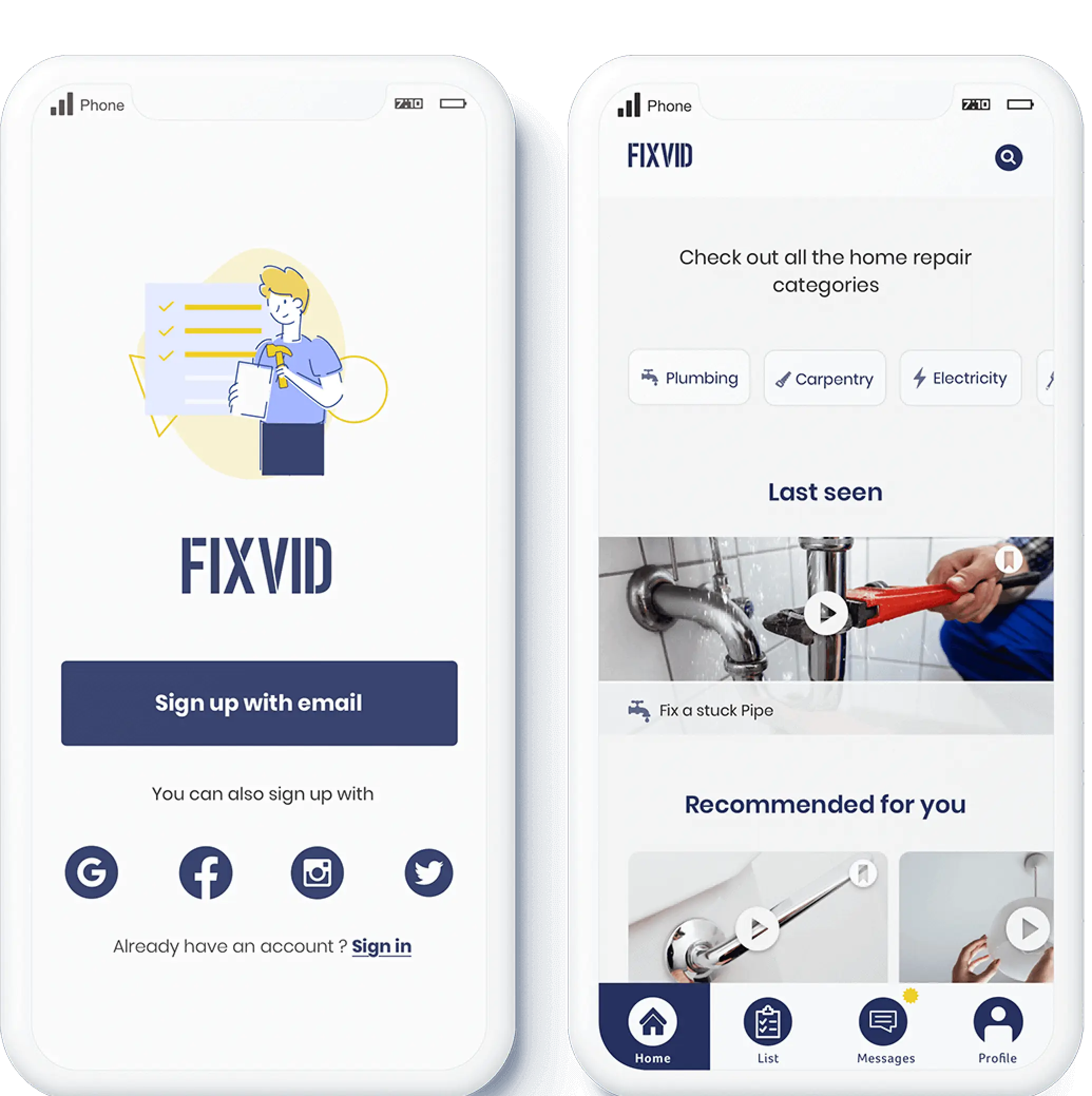
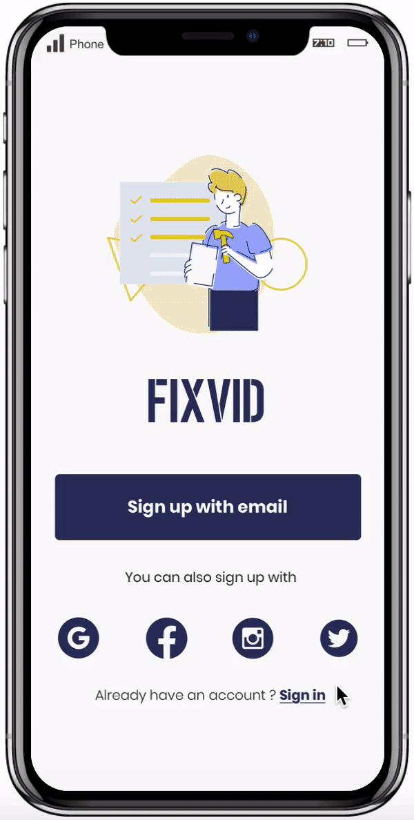
FixVid: E-learning mobile application for home repairs
Case study: Design mobile app.
Goal: Help people easily perform house repairs with an e-learning platform for mobile.
Scope: Personal UX | UI Design project.
Role: Solo project where I was responsible for all UX and UI design tasks.
UX Research
IA
IxD
UI Design
Prototyping
-
 Sketch | Marvel
-
 3 Weeks
Problem context
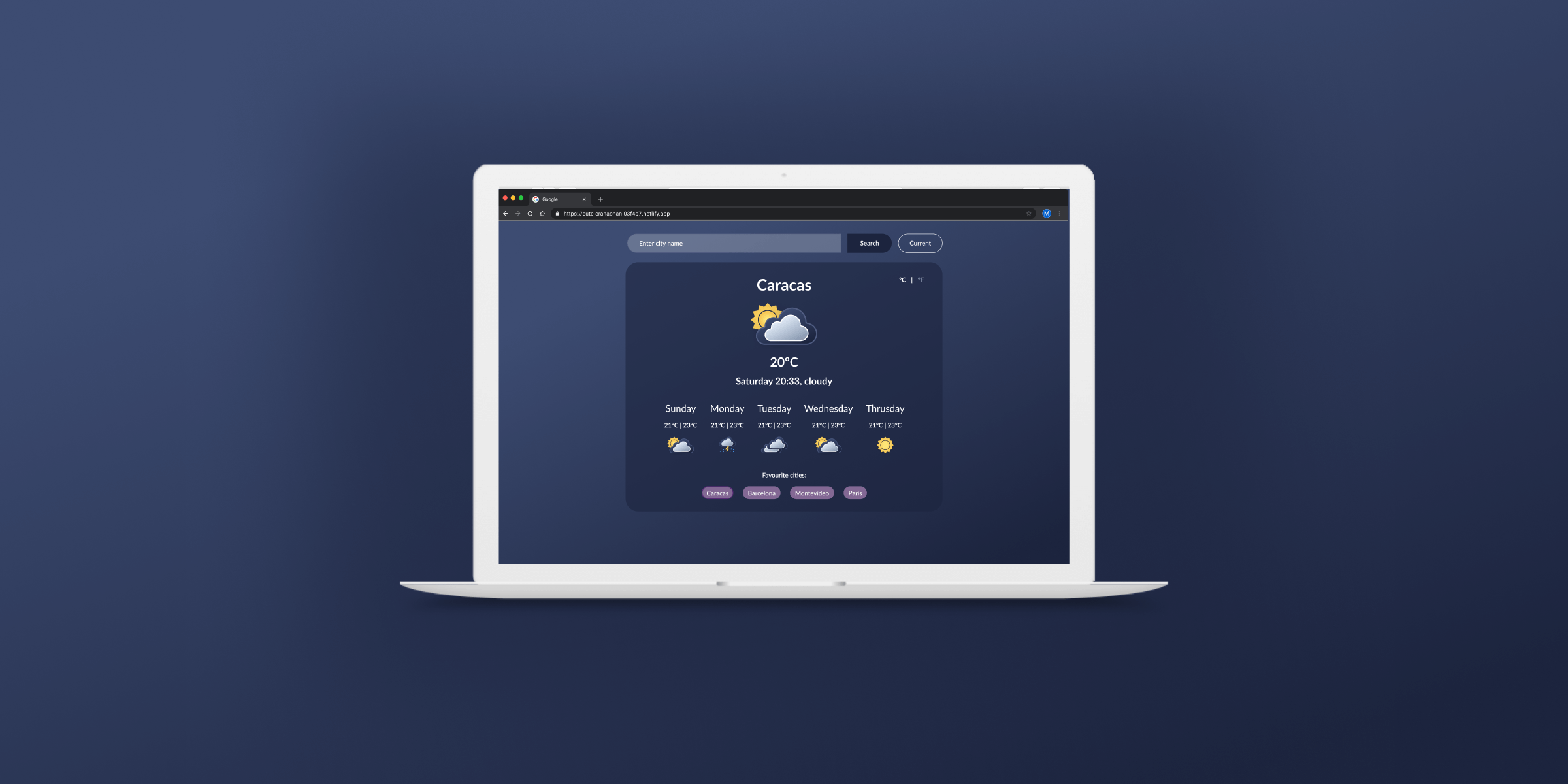
Checking the weather has become a daily practice for most of us. As users, we check the weather in our location, and if we are going on a trip, we want to see how the weather will be in that location. Added to that, lots of us have important family members in different cities and countries, so we want able to access these special cities in an easy way.
The final goal was to design and develop a weather app using HTML, CSS and Javascript.
Design process
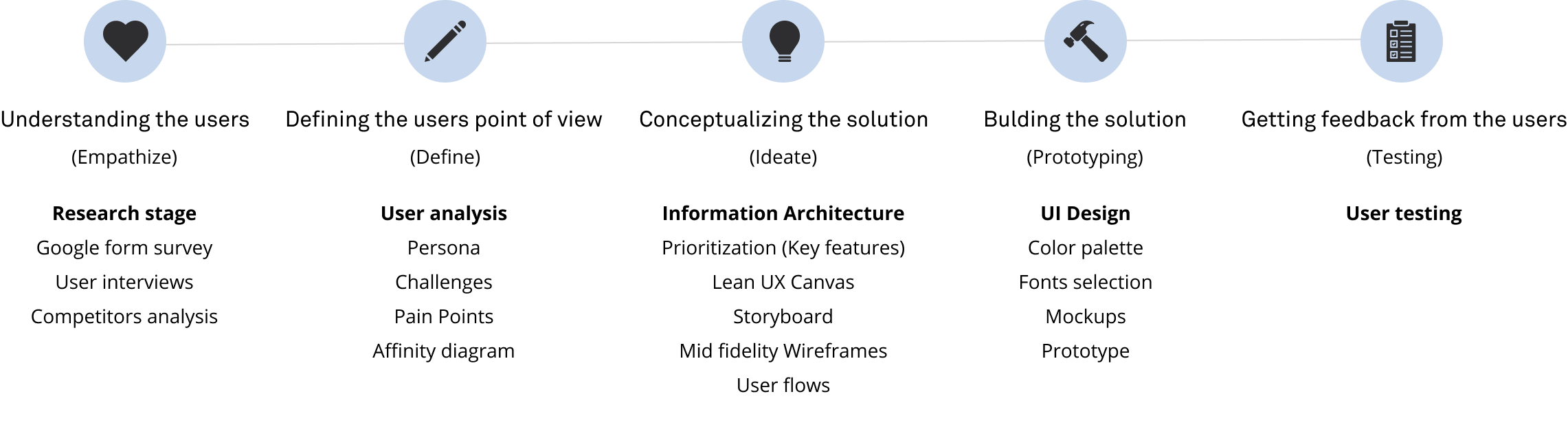
Research
For the research process, I conducted interviews and shared a survey with people aged between 20 and 30 years old. I wanted to mainly focus on people that lived by themselves or with a partner.
My goal was to understand the steps people take when something breaks down at their home. Who do they turn to for help first? Do they prefer to hire someone to do the repairs?
Survey insights
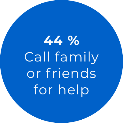
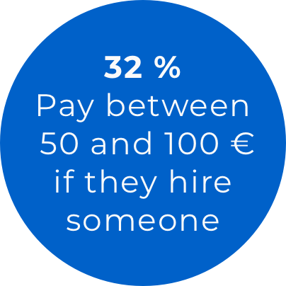
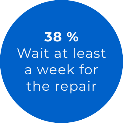
Sample of 34 people
Interview insights
- Tendency to first ask for help from family or friends.
- If there is no help available, they watch videos on the Internet on how to do the repair themselves.
- People have a feeling that they could do the repair by themselves.
- There is no interest in doing super complex repairs.
- They want to save time and not having to rely on others.
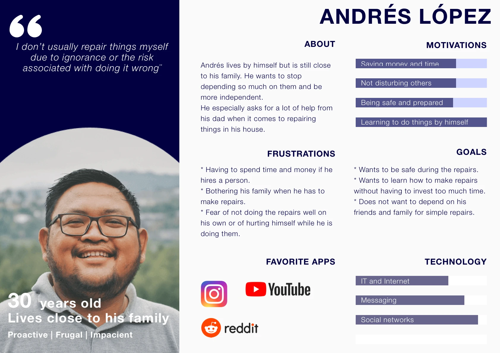
User
Persona
×
Pain Points
The following image shows Andrés User Journey and all the pain points that are triggered when he needs to do a home repair.

Pain points targeted
- Spending too much time searching and watching videos that best suits his needs.
- Unable to do the repair on its own and its afraid to get hurt while doing the repair.
Information Architecture
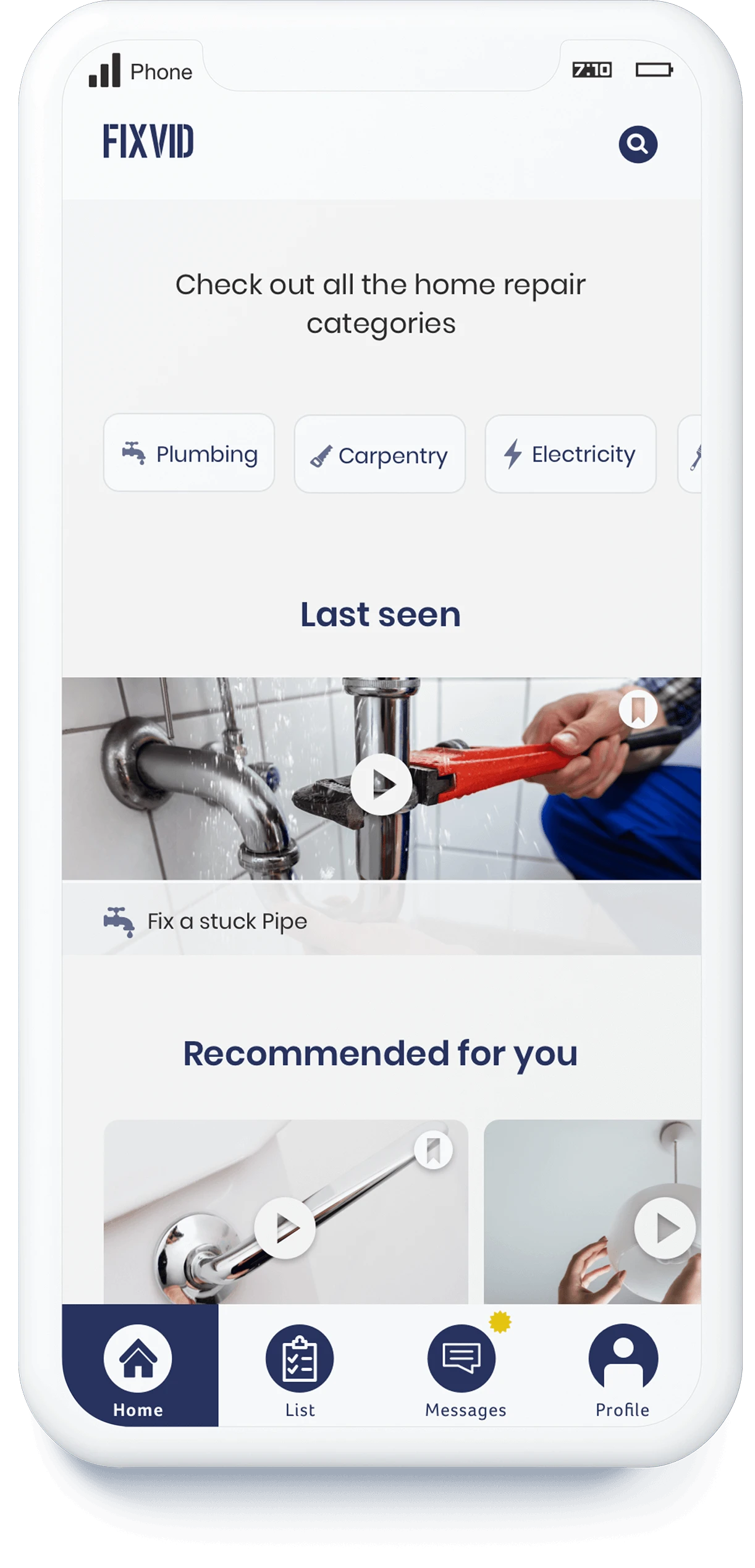
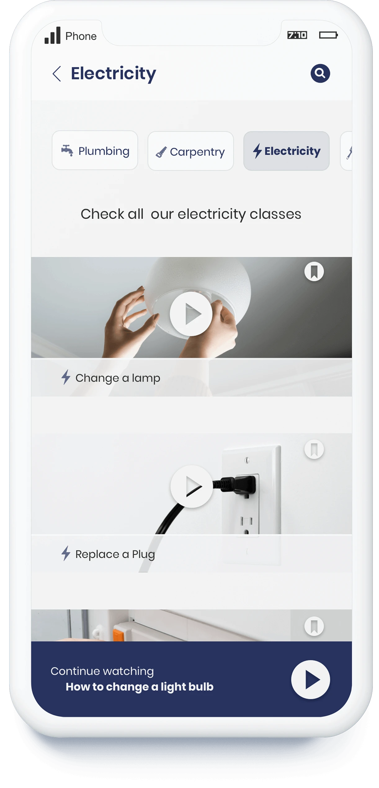
To build the site architecture I worked on the concept sketching, competitive analysis and card sorting to define how the home repair classes will be categorized and structured. From that analysis the following site map was defined. The main goal was for the class contents to be easily found through a search bar or through predefined categories.
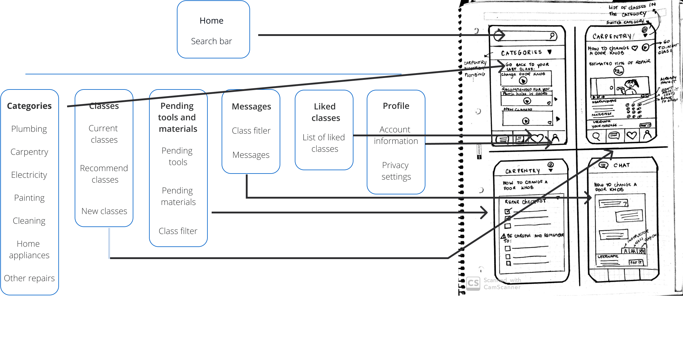
Key features
- Two search methods: predefine categories and search bar.
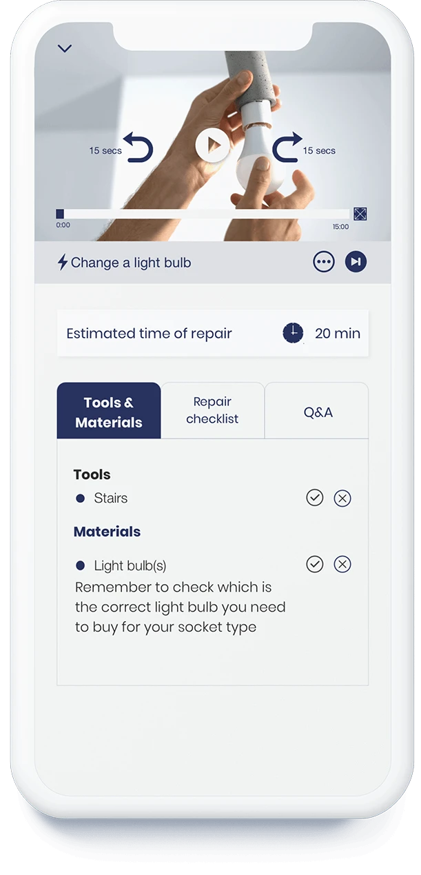
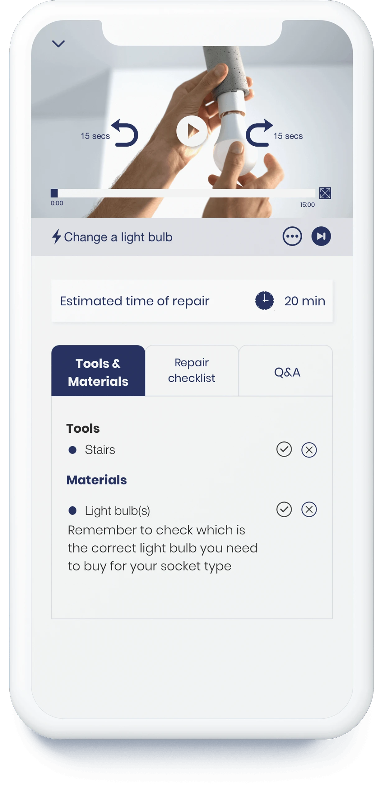
- Classes of less than 15 minutes (44% of the interviewees indicated that this would be the time they could spend each day learning about home repairs). Each class clearly displays the tools and materials necessary to carry out the repair.
- Direct access to the pending tools and materials from the tab bar.
- Repair checklist to help users make sure that they are ready to start the repair.
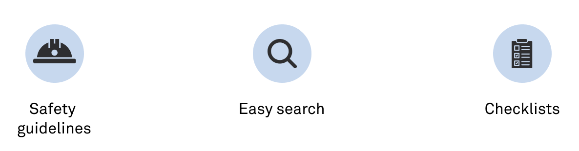
- Safety guidelines for each class.
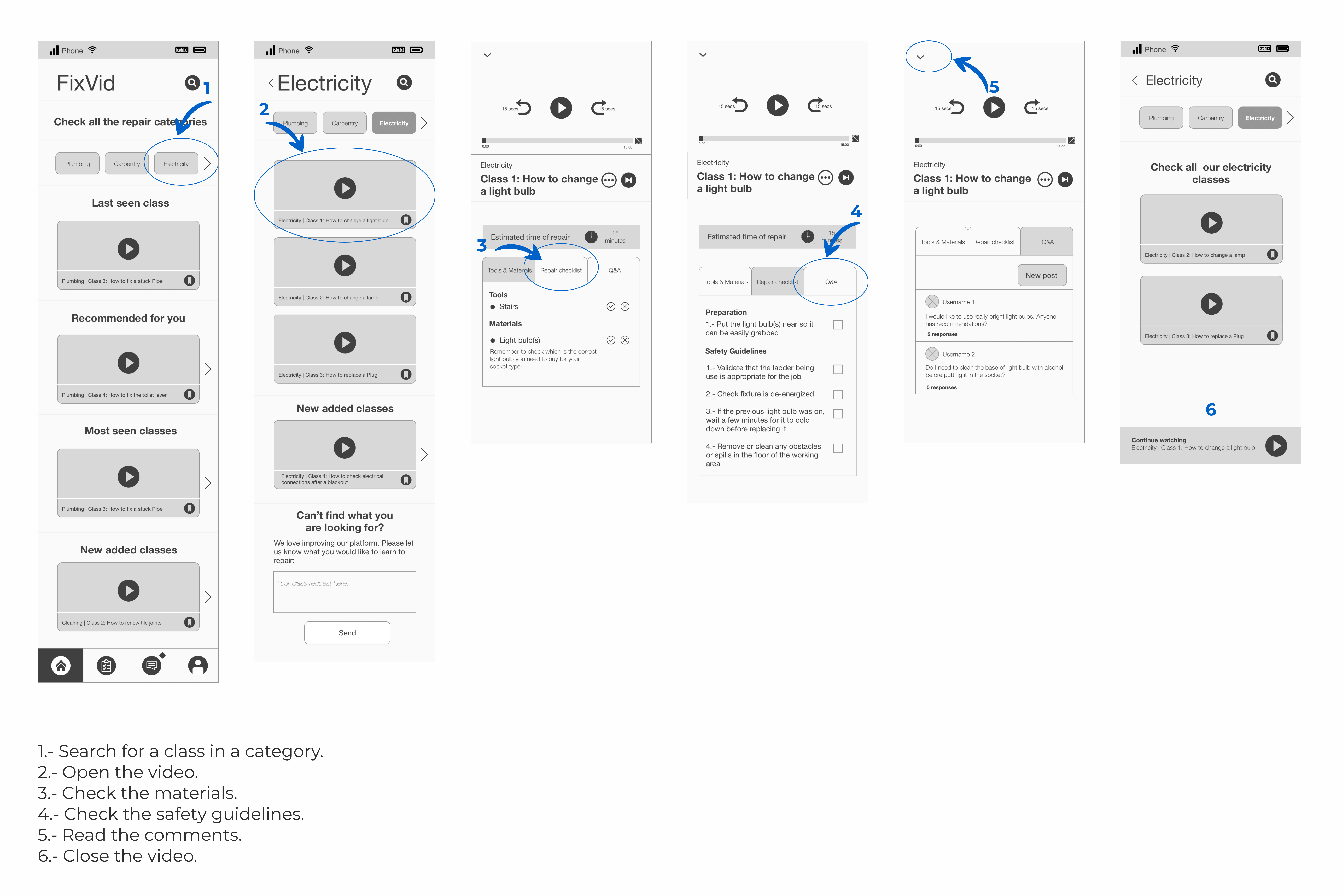
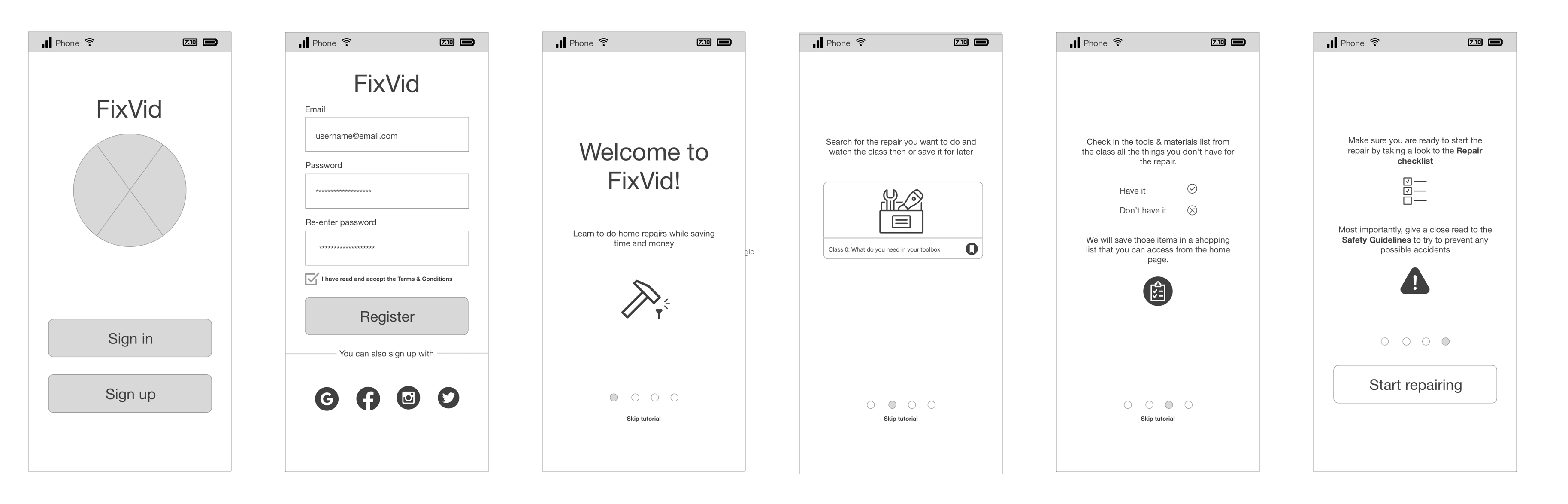
Wireframes
The design of the e-learning platform was built as a mobile app since it was the device that most users claimed to prefer during the research stage (51% in the survey).
User flows
Below is the user flow when Andrés needs to look for an specific repair. He will need to:
- 1 - Search for a class in a category.
- 2 - Open the video.
- 3 - Check the materials.
- 4 - Check the safety guidelines.
- 5 - Read the comments.
- 6 - Close the video.
In the project gallery you can find more user flows for the app.
×
Testing
The first version of the Wireframes was tested on 5 users. The results help improve the design and the changes were applied to the mockups shown on the next section.

UI Design
Color palette
I've got inspiration from the colors of common tools that are used on repairs (tape measure and levels).
#2A3462
#FAFAFA
#EBCA10
Fonts
For the fonts, I kept a simple design by only using one family, playing with the weights and sizes to stablish the hierarchy.


Mockups
Prototype
The following gif shows the user interaction when he wants to watch a class.
Outcomes & lessons learnt
- One important challenge was having all the clickable icons and buttons in the proper size to guarantee the usability of the app. Having tested the app on different users, helped to detect there was an issue with this and the proper improvements could be made.
- For solo projects its mandatory to prioritize the issues that would aliviate our user pain points the most.
- Another challenge encountered was to try to guarantee the safety of the users while they perform the repairs. The solution proposed offers a way for them to be prepared before the repair and to be conscious of the things they need to be careful of.
- For e-learning platforms is important to adjutst the content and its organization according to the type of information that will be presented. In the case of this project, a linear order of the classes was not needed, the best option was for the users to be able to access the content they need when they wanted it.
Project gallery
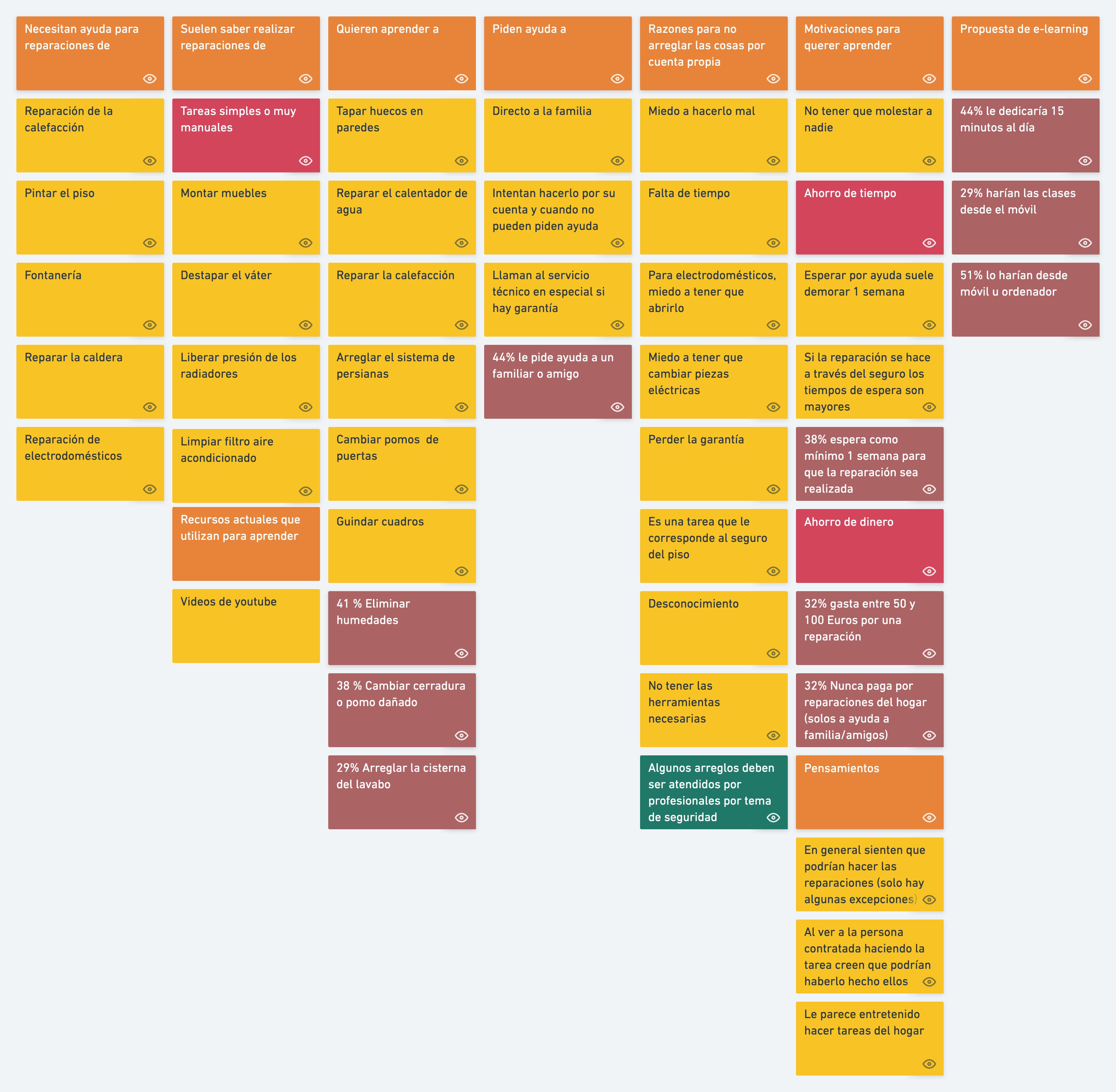
Affinity diagram
×
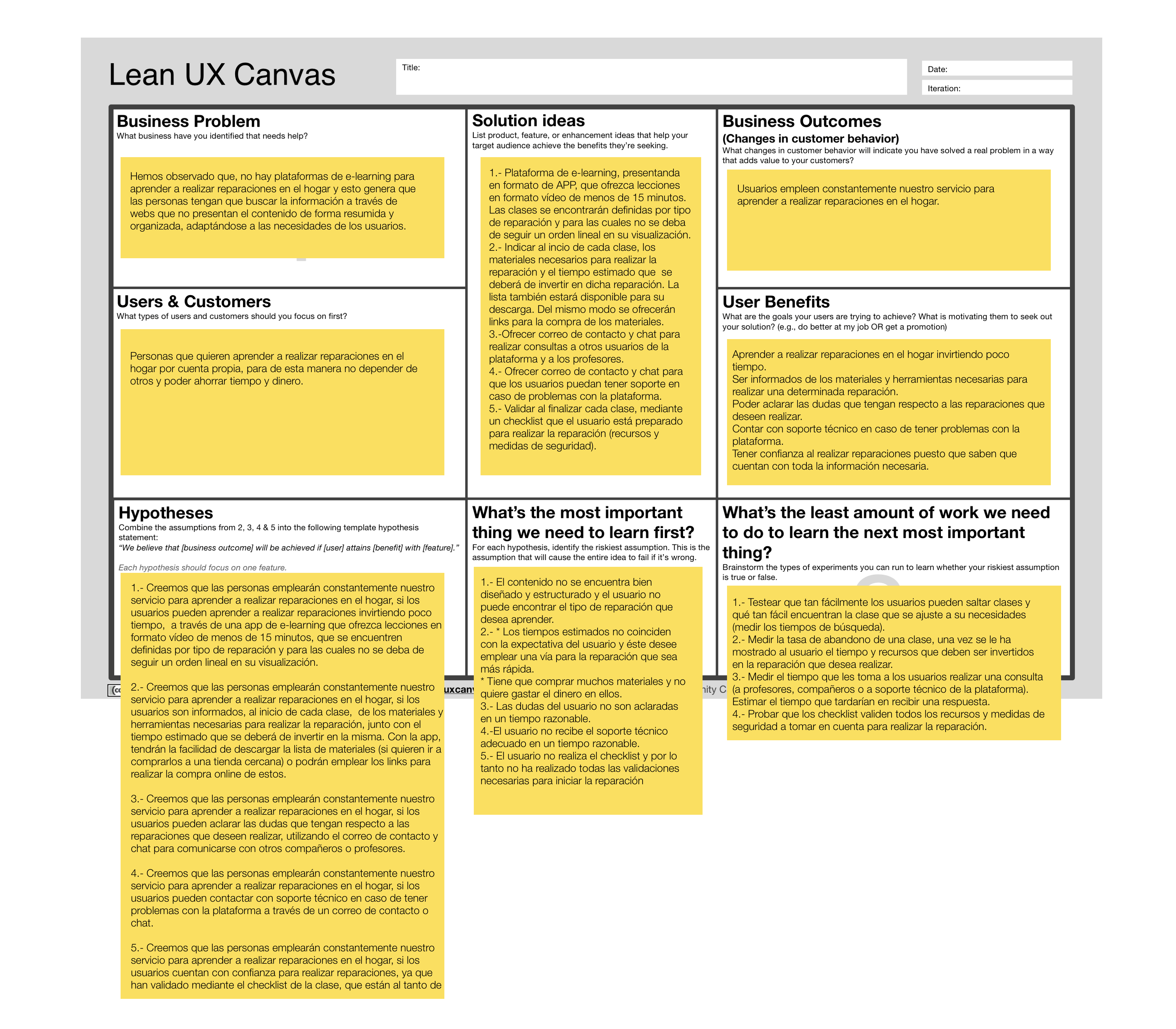
Lean UX Canvas
×
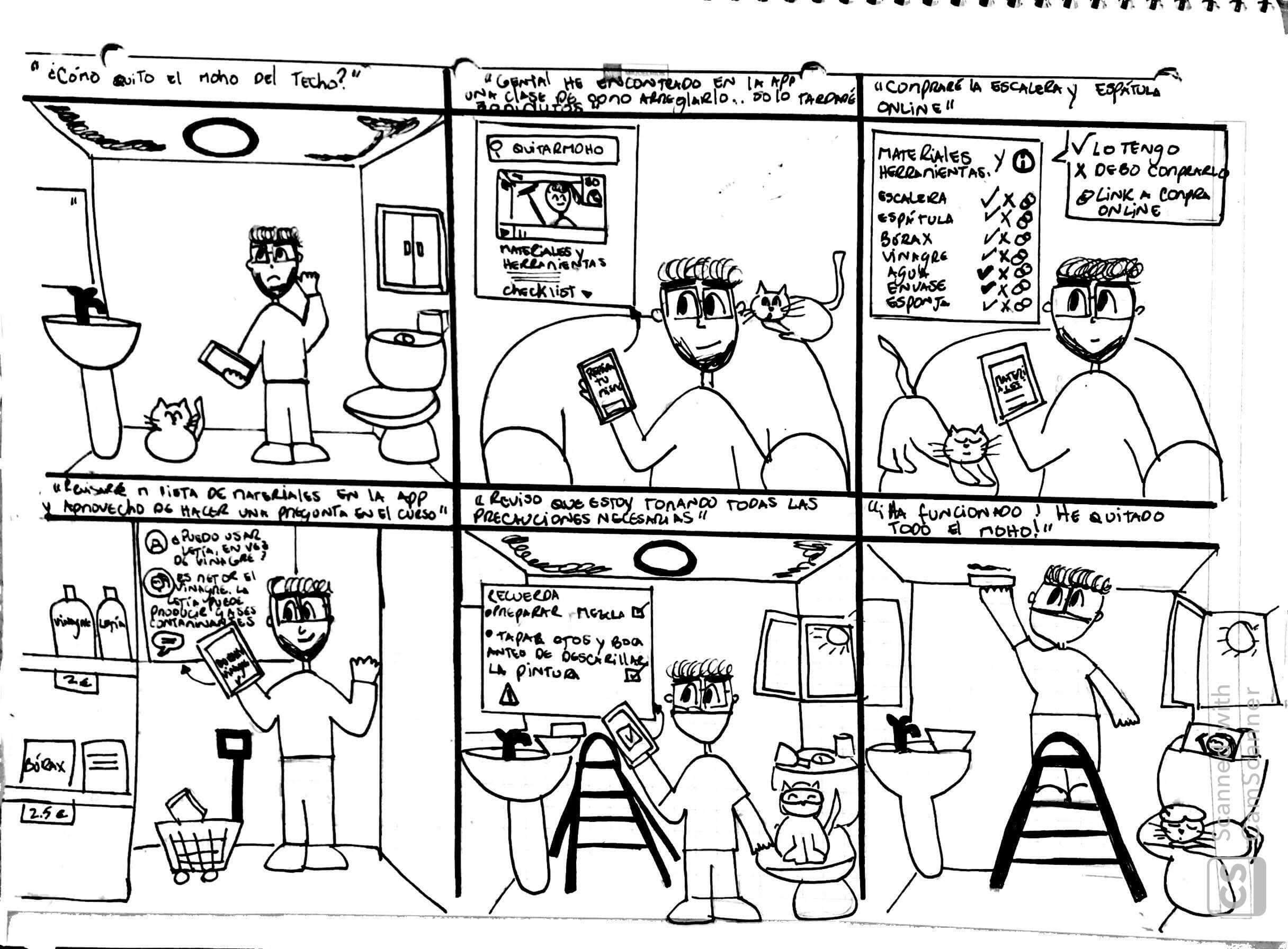
Storyboard
×
Userflow onboarding
×
Pictures & icons appreciation
Icons
- Arrow: Kidaha from the Noun Project.
- List: Checklist by QualityIcons from the Noun Project.
- Safety and Search: Iconify
- User journey person (edited): nerd by Xinh Studio from the Noun Project.
- Wireframe icons: Sketch Iconify.
Pictures
- Classes photos: Adobe Stock.
- User persona: Aryo Lahap on Unsplash.
Illustrations
- Draw.io (edited)