Project mockups

Science Society Festival:

responsive event microsite

Case study:  Design responsive event microsite.

Goal:  Allow users to easily access the festival information (participants, talks and location) as well as a simple path to purchase tickets.

Scope:  Personal UX | UI Design project.

Role:  Solo project where I was responsible for all UX and UI design tasks.

Market Research
IA
UI Design
Tool icon

Sketch | Invision

Clock icon

1 Week

Problem context

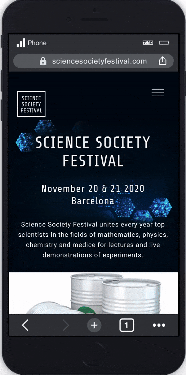
Going to a festival is a great experience, specially a science festival where attendees go to get insightful talks and grow their knowledge on different topics (medicine, chemistry, mathematics and physics).  A great way to increase the attendance is to provide a useful, informative and easy to navigate site. A disorganized and hard to navigate page can easily discourage people to go to the festival.

Design process

Design process

Research

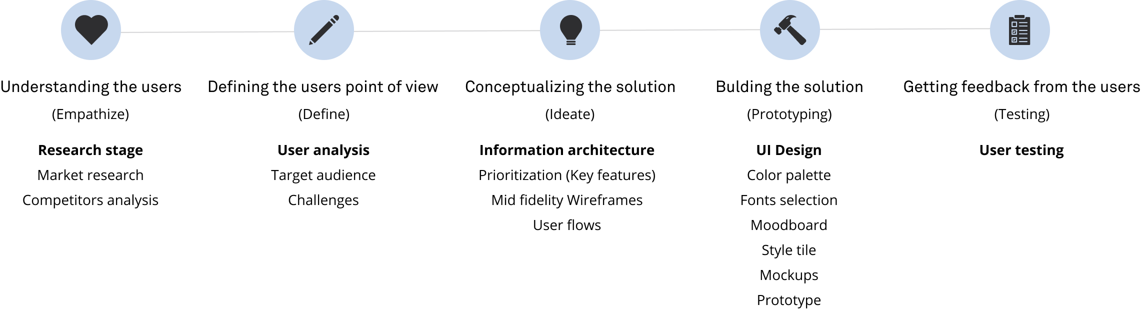
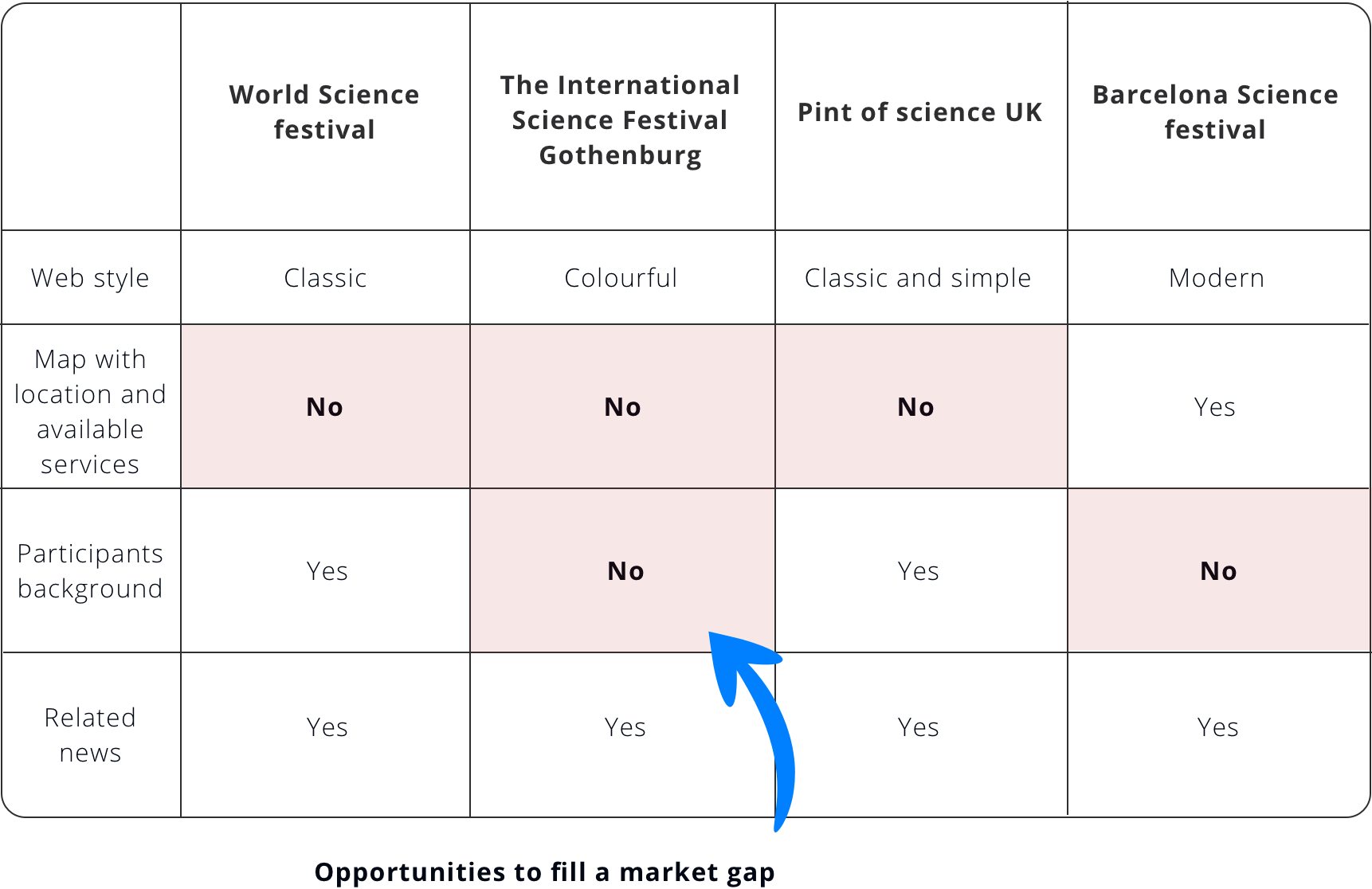
There are many science festivals that are celebrated in different cities around the world. For the research stage  I ran a competitive analysis based on the following popular science festivals that have a target audience of academics.

Competitors analysis insights

Competitors analysis

User

Target audience

From the research process and the topic of the festival, the following target audience was defined:

  • University students, graduates, professors.
  • Live in the same city of the event or in near by cities.
  • Go more than once a year to a scientific festival.

Users challenges

  • Find easily all the information they need to assist to the festival.
  • Be able to filter the information according to their needs (they might want to go to the talks of an specific science area e.g: chemistry).
  • Purchase the ticket in an easy and fast way.
Target user

Information Architecture

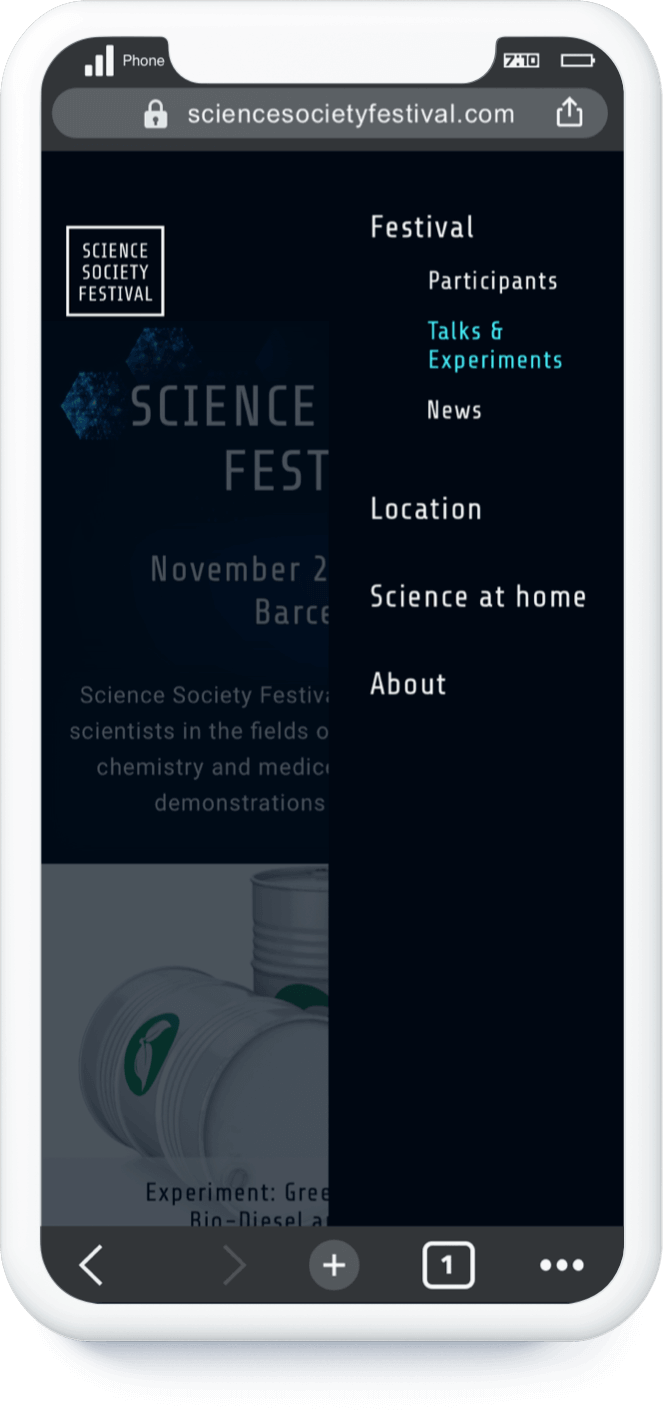
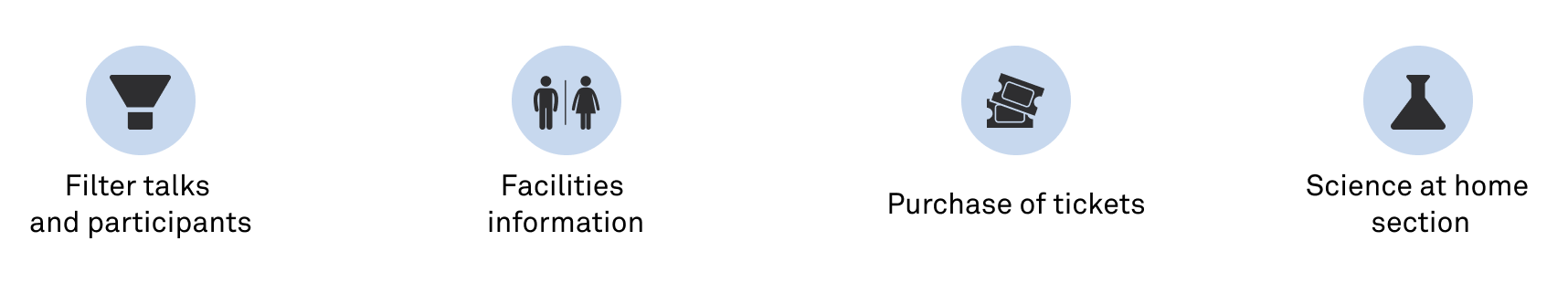
To build the site architecture I followed the insights of the competitive analysis and established the following structure:

Site map

The 'Science at home' section is a way to introduce more interaction with the users through an educational process that is linked to the theme of the festival. I set on the footer the rest of sections that are not that frequently consulted by the users.  The main focus of the architecture, was to provide an easy access to the ticket purchasing process and to the main information of the event.

Wireframes

Key features

Key features
  • Option to filter the talks and speakers according to their science field.
  • Provide information on the facilities available at the venue and the transport methods to get there.
  • Facilitate the purchase of tickets to the event.
  • For the interactive science at home section, I focused on the following elements:
    • Videos of other talks.
    • Videos of physics and chemistry experiments.
    • Experiment interaction where the users could see step by step a chemical reaction.

User flows

Below are the user flows of the web (desktop version) when our users want to purchase festival tickets after reviewing the talks that will be presented.

  1. 1 - Go to the festival section.
  2. 2 - Select the talks
  3. 3 - Check talk and speaker information.
  4. 4 - Purchase festival ticket.
User flow for reviewing the talks and buying tickets

Testing

Testing results

The testing process was done with 8 users (4 used the Desktop version and 4 the mobile version).  Main insights:

  • The hover interactions used on the desktop design should not be mandatory interactions that would affect the usability in touch based devices. This was the case for the filters and for how the information of the talks is displayed.
  • Some elements on the layer were not exactly on the same place. This was noticeable on the transitions.
  • The IA was well understood by the users.

Redesign

  • From the issues encountered on the testing phase the hover interaction was replaced for an interaction that didn't compromise the usability on touch based devices.
  • The results helped improve the design and the changes were applied to the mockups presented in the following section.

UI Design

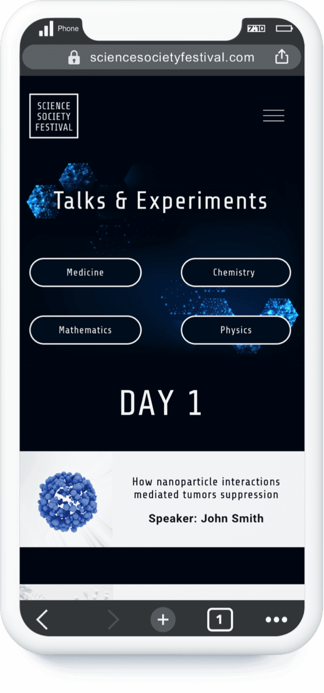
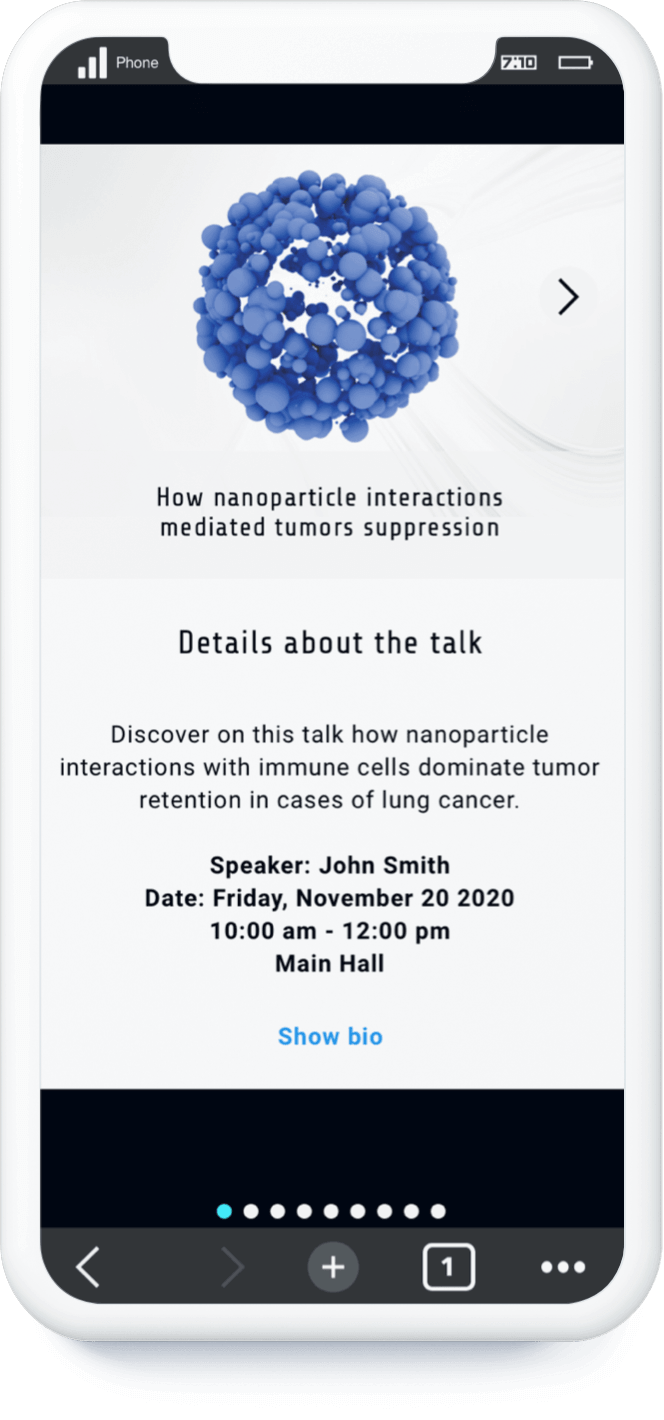
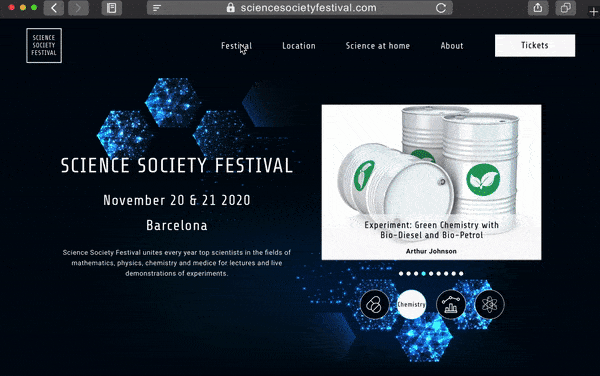
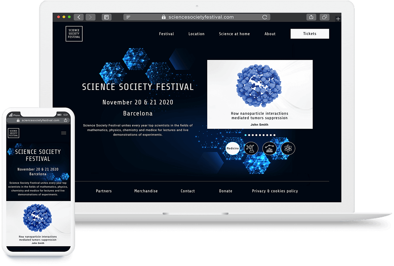
The goal was to present a design that gave a scientific feeling.  The treatment of the images was a very important point to keep a clean style that didn't make the site feel overwhelming.

Color palette

To give a different look to the site I wanted to introduce color. I went with blues since is a color that coveys wisdom and technology, which go hand to hand with science.

#010F1D

#46EFFE

#FAFAFA

Fonts

For the fonts, I used Share Tech for the headers and Roboto for the text bodies. I chose Share tech since it reminisce scientific articles and Roboto for its readability.

Share Tech regular
Roboto bold
Roboto regular

Mockups

Mobile mockup search Mobile mockup talks Mobile mockup talk information

Prototype

Festival talks and Science at home section (Mobile version)

Prototype Festival talks and Science at home section

Location section - Transportation methods and amenities (Desktop version)

Outcomes & lessons learnt

  • Through this project I learned more about the importance of a well structured IA and how it is key for sites that include a broad variety of categories. Properly organizing that information and allowing it to be easily filtered is mandatory to offer a seamless user experience.
  • Another lesson learned was that the use of hover must be left for non-relevant interactions that don’t affect the usability of the site on touch-based devices. For a responsive design to be successful, the interactions should be selected in other to work for touch-based and non-touch based devices at the same time.

Pictures & icons appreciation

Icons

  • Chemistry: by priyanka from the Noun Project
  • Bathroom: Bathroom by Creative Mania from the Noun Project
  • Filter: by Kirby Wu from the Noun Project
  • Math (edited): by Template from the Noun Project
  • Medicine : by Vectorstall from the Noun Project
  • Physics: by Made from the Noun Project
  • Ticket: by Setyo Ari Wibowo from the Noun Project
  • Experiment: by An Chi from the Noun Project

Pictures

  • Talks photos: Adobe Stock.
  • User persona: Adobe Stock
  • Participants:
    • Steve Duran: Photo by Michał Parzuchowski on Unsplash
    • Carol Diaz: Photo by Juan Rojas on Unsplash
    • Arthur Johnson: Photo by Bahram Bayat on Unsplash
    • Anne Medina: Photo by 6v1a_pctego on Unsplash
    • Marcos Rodriguez: Photo by christian buehner on Unsplash
    • Laura Yoon: Photo by Annika Palmari on Unsplash